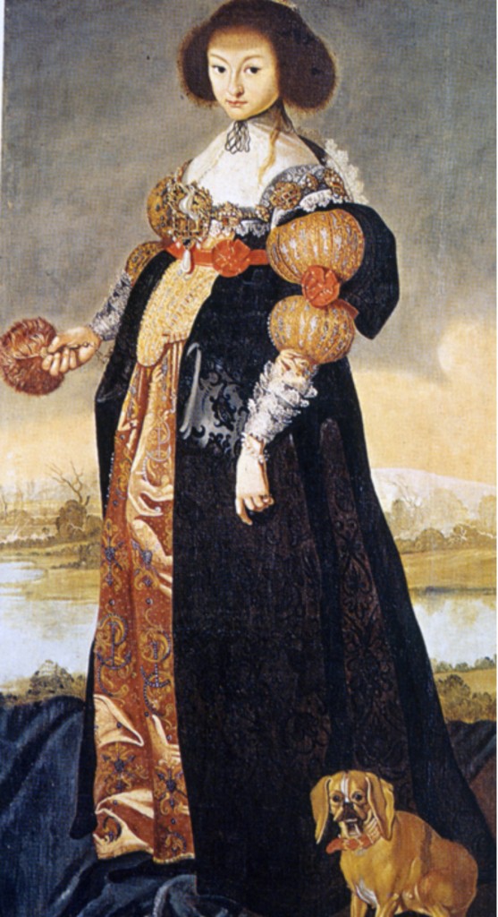
Another one for the obscure “I-never-thought-I’d-really-see-this-in-person” category! So, I show this painting to my fashion students every semester:
Part of it is talking about early 17th century women’s dress, but I use it as a metaphor for their own designs as well. A good example of what you’d call an “awkward transitional silhouette,” this girl has it ALL going on. Multiple waistlines, competing necklines, warring fabric choices – not to mention the dropped shoulder / dropped sleeve / layered sleeve / puffed sleeve / with slashing / and a rosette / AND tiered cuffs…its an agony of excess. When I relate it to their own designs, and how some of them have the design philosophy of “too much is never enough!” they all know exactly what I’m talking about. The “oops I was accidentally trying to tell my whole life’s story in this one dress” quandary. We refer to it in shorthand as the “Ugly Betty Dress” and it becomes code for “simpler is sometimes better.”
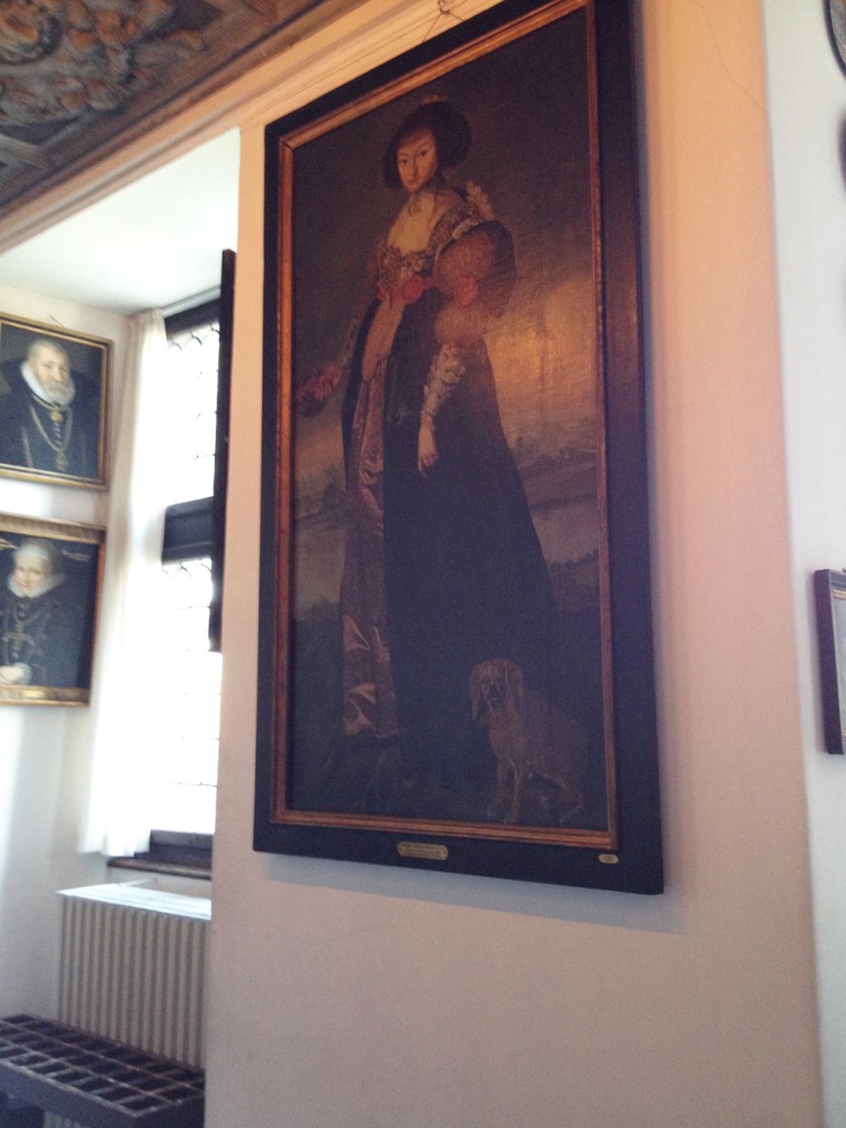
And LOOK! I came out of a typical castle-y room at the Rosenborg Castle in Copenhagen and THERE IT WAS JUST HANGING ON THE WALL!

The thing about the lighting in castles is, you can never actually see a painting without a horrible glare and/or complete darkness.
It was an exciting moment. Maybe you had to be there.
Sorry, this wasn’t at ALL about menswear. We all need a break. Even me.

I think I first saw this picture in the Boucher book. Astonishingly unattractive. Even her hair, which I don’t think you mentioned , is ugly. Heck, even the DOG is ugly ! !
Totally! The amazing thing is, there are more like her! Apparently, ugly was in. The 17th cent version of Normcore? I think I took pictures of some other ones, I’ll see if I can find them.